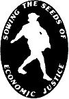
 Since our founding, Just Harvest’s logo has been a figure that we have referred to as The Sower. Sometimes confused with Johnny Appleseed (and the Morton Salt girl!), he did indeed come from another era but was a potent symbol of this organization’s mission for nearly thirty years.
The Sower’s Origin:
In 1986, during the disbanding of Pittsburgh’s Hunger Action Coalition I was helping to organize the first meetings of the founding board and staff of what would become Just Harvest. Our challenge was to respect and continue Hunger Action’s legacy of policy advocacy while also building a new organization from the ground up.
Among other tasks, we adopted our mission statement, wrote by-laws and key principles, and chose the name “Just Harvest” to emphasize that the elimination of hunger for all is a matter of fundamental justice. The founders chose “Sowing the Seeds of Economic Justice” as a slogan, but we struggled to create a logo that would visually communicate those ideas.

In 1850, the French realist painter Jean-Francois Millet exhibited his first masterpiece, The Sower. He painted several versions over the years, one of which lives right here in Pittsburgh’s Carnegie Museum of Art.
Then, coincidentally, on a visit to the Carnegie, I saw Millet’s The Sower and brought photocopies of a postcard of it to the next board meeting. The board agreed that it was a powerful image of the strength and dignity of working class people and of their struggle to put food on the table. 
A designer at a local printing firm stylized it into the logo we have used ever since. When we entered the world of social media in recent years, a colorized Sower became our avatar.
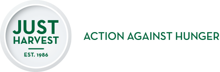
Our New Logo
As Just Harvest has grown and developed over the last quarter century, our Sower has gotten a bit out-of-date, a bit tired, a bit confusing. Are we urban farmers? (No.) Are we a gleaning program? (No.) Does the word “Just” refer to “justice” or is it meant more like Nike’s “Just do it”? (The former.) After 28 years, are we still just (?!) sowing seeds or are the crops of economic justice finally growing and spreading? (We think the latter.)
Last spring, led by our communications coordinator Emily Cleath, Just Harvest formed a committee of board and staff members to work on a new logo to freshen our appearance for a new generation. We wanted a logo that would emphasize action and progress, build on our history, and keep the “Justice” in Just Harvest.
With the creative leadership, insight, and skills of designer Bill Krowinski and support from copywriter Ann Trondle-Price, Just Harvest is thrilled to present our new visual mark and tagline.
Personally, I see in it not only the empty plate of hunger that a just harvest will fill, but also a bull’s-eye that keeps us focused on our goals, a symbol of our growing circle of allies and supporters, and even a respectful nod to our origins in the Hunger Action Coalition.
Our logo has indeed come full circle. With it we are looking forward to a new era of Just Harvest in which we as a community – and perhaps even a nation – finally find the will and the power to end hunger once and for all.
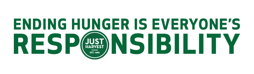


Sorry, Ken and company. The new logo is not as memorable as the old one. It does not even appear to be a plate.